
Once we decided on the date, we had to choose a venue, and FAST. We knew that our date would fill up very quickly, and so we had to select one over the winter holidays. We chose Indianapolis as our location, because most of my family and a lot of our friends are there. It seemed relatively central to most people we knew. And there are some great places in this city to throw a shindig!
After looking at a few places, we decided on the Fountain Square Theater, a beautiful renovated 1920's theater that is now rented out for special events. I actually used to go there in high school and college to their Swing Dance Nights. I have many fond memories of that theater and eating sour cream fries at Peppy's afterward (not as much recommended). It was funky and fun, just what we wanted. And, being a renovated theater, we got to do this:

This was the theater marquee on the day of our wedding. It was so awesome to drive up and see it!
Our invitations were the next big hurdle to accomplish (of course, I bought a dress, chose bridesmaids, flowers, and all that other wedding stuff, but you came here to see the art!). I have to say it was the only thing we butted heads over throughout the wedding planning. We're both pretty particular, and we both had a set idea of our ideal. We eventually reached a compromise, and the set ended up looking fantastic.
The colors we decided on were red, deep purple, gold, and orange. Fall is our favorite time of year, and so we wanted lovely autumn colors on everything. (One bridal store I went into asked my colors as I tried on dresses, and then when I listed them, the woman turned to my mom and said "Well, looks like somebody hasn't decided yet!" Looks more like somebody didn't make a sale that day!) Everything, from the invitations to the flowers to the dresses, was an explosion of color.
For the invites, we wanted a long format, and so we designed them to fit in #10 envelopes, which we bought in our colors, and addressed with silver or gold pens. Paper Source was my best friend during this time, and later, Arvey Paper in Indianapolis. We used Overnight Prints for the printing and they were great.
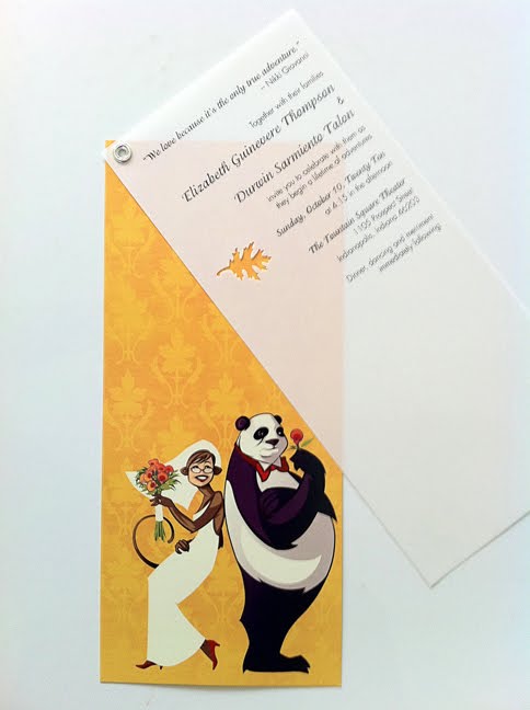
We did a vellum overlay on top of the postcard with the design, and this is what we came up with:
 (Click to embiggen)
I love how Durwin made a monkey look so graceful! Because in real life, I am not.
So, this is what you would see when you opened up your envelope:
 (Click to embiggen)
We had orange bands on the real invites, with the leaf punch, but I think we ran out by the end.
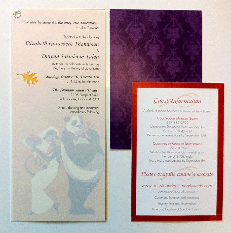
The set:
 (Click to embiggen)
There's a reply card (purple), a map to the theater and hotel information (red) and the invite itself. The most fun was the song request line we included on the reply card. Not everyone did it, but we got some really fun (and hilarious) song requests, which we tried to include in the playlist (which the DJ pretty much ignored, but that's for another day). We printed the invitation wording on laser-jet vellum and put it together with a silver grommet (if you do not have a crop-a-dile, or whatever those things are called, please go buy yourself one if you plan on doing anything of this quantity. 150 invites later and my hands would have been dead without it!). The leaf punch was an accident at first, but we liked how it looked, so we kept it.
And the invite itself up close:
 (Click to embiggen)
I love how they turned out.


No comments:
Post a Comment